ShopDreamUp AI ArtDreamUp
Deviation Actions


![Commission Information [PREVIEW]](https://images-wixmp-ed30a86b8c4ca887773594c2.wixmp.com/f/44689325-5167-4380-b4a2-1b6ec439d9a8/d8pgs3t-7635fb71-9d9b-403e-a6aa-e9f92eca9835.png/v1/crop/w_92,h_92,x_0,y_24,scl_0.059354838709677/commission_information__preview__by_nsio_d8pgs3t-92s.png?token=eyJ0eXAiOiJKV1QiLCJhbGciOiJIUzI1NiJ9.eyJzdWIiOiJ1cm46YXBwOjdlMGQxODg5ODIyNjQzNzNhNWYwZDQxNWVhMGQyNmUwIiwiaXNzIjoidXJuOmFwcDo3ZTBkMTg4OTgyMjY0MzczYTVmMGQ0MTVlYTBkMjZlMCIsIm9iaiI6W1t7ImhlaWdodCI6Ijw9MzE3MiIsInBhdGgiOiJcL2ZcLzQ0Njg5MzI1LTUxNjctNDM4MC1iNGEyLTFiNmVjNDM5ZDlhOFwvZDhwZ3MzdC03NjM1ZmI3MS05ZDliLTQwM2UtYTZhYS1lOWY5MmVjYTk4MzUucG5nIiwid2lkdGgiOiI8PTE1NTAifV1dLCJhdWQiOlsidXJuOnNlcnZpY2U6aW1hZ2Uub3BlcmF0aW9ucyJdfQ.doCvmcszzjxRxux11R1BkafqmHug8YjmKNHJNt7Ms_Q)


![LIVESTREAM: Nsio Super POV Practice WIP [OFFLINE]](https://images-wixmp-ed30a86b8c4ca887773594c2.wixmp.com/f/44689325-5167-4380-b4a2-1b6ec439d9a8/d7l47if-079f3091-a275-4ac1-8dbc-95fe5e9ff9b8.jpg/v1/crop/w_92,h_92,x_8,y_0,scl_0.080209241499564,q_70,strp/livestream__nsio_super_pov_practice_wip__offline__by_nsio_d7l47if-92s.jpg?token=eyJ0eXAiOiJKV1QiLCJhbGciOiJIUzI1NiJ9.eyJzdWIiOiJ1cm46YXBwOjdlMGQxODg5ODIyNjQzNzNhNWYwZDQxNWVhMGQyNmUwIiwiaXNzIjoidXJuOmFwcDo3ZTBkMTg4OTgyMjY0MzczYTVmMGQ0MTVlYTBkMjZlMCIsIm9iaiI6W1t7ImhlaWdodCI6Ijw9OTQ1IiwicGF0aCI6IlwvZlwvNDQ2ODkzMjUtNTE2Ny00MzgwLWI0YTItMWI2ZWM0MzlkOWE4XC9kN2w0N2lmLTA3OWYzMDkxLWEyNzUtNGFjMS04ZGJjLTk1ZmU1ZTlmZjliOC5qcGciLCJ3aWR0aCI6Ijw9MTI4MCJ9XV0sImF1ZCI6WyJ1cm46c2VydmljZTppbWFnZS5vcGVyYXRpb25zIl19.nxI8IlzK8-3hKEPs6qVX0WEAl8bHy_A_GPMzlFg_2V4)

Suggested Deviants


Suggested Collections


You Might Like…


Featured in Groups


Description
I know nothing can stay unchanged to the eternity, but it doesn't mean that we should just accept everything that's brought in front of us. DeviantART is quite a spectacular example of this, but rather than bashing their actions, I wanted to explain myself why I don't like the new dA logo. I'm already in terms with it, but I'm still uneasy with it. Here is my analyze why the logo doesn't work and also an example how it could be fixed. Feel free to call me just typical whiner, but before doing so I kindly ask you to read my arguments ")
Similar alterations:


Analysis of the situation etc.


(If I had premium, I could have linked thumbnails, but these will do for now)
"New DeviantART logo - Why it doesn't work and how to fix it" by Nsio
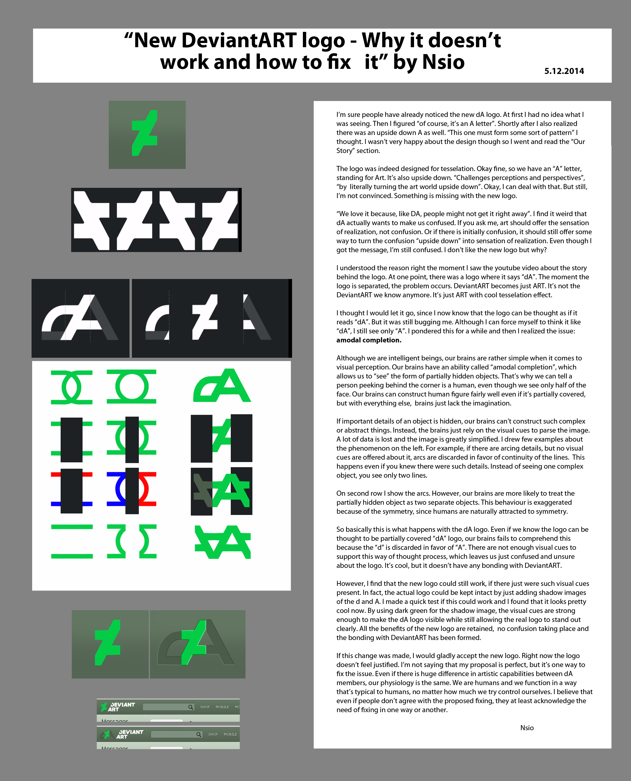
I’m sure people have already noticed the new dA logo. At first I had no idea what I was seeing. Then I figured “of course, it’s an A letter”. Shortly after I also realized there was an upside down A as well. “This one must form some sort of pattern” I thought. I wasn’t very happy about the design though so I went and read the “Our Story” section.
The logo was indeed designed for tesselation. Okay fine, so we have an “A” letter, standing for Art. It’s also upside down. “Challenges perceptions and perspectives”, “by literally turning the art world upside down”. Okay, I can deal with that. But still, I’m not convinced. Something is missing with the new logo. “We love it because, like DA, people might not get it right away”. I find it weird that dA actually wants to make us confused. If you ask me, art should offer the sensation of realization, not confusion. Or if there is initially confusion, it should still offer some way to turn the confusion “upside down” into sensation of realization. Even though I got the message, I’m still confused. I don’t like the new logo but why?
I understood the reason right the moment I saw the youtube video about the story behind the logo. At one point, there was a logo where it says “dA”. The moment the logo is separated, the problem occurs. DeviantART becomes just ART. It’s not the DeviantART we know anymore. It’s just ART with cool tesselation effect.
I thought I would let it go, since I now know that the logo can be thought as if it reads “dA”. But it was still bugging me. Although I can force myself to think it like “dA”, I still see only “A”. I pondered this for a while and then I realized the issue: amodal completion.
Although we are intelligent beings, our brains are rather simple when it comes to visual perception. Our brains have an ability called “amodal completion”, which allows us to “see” the form of partially hidden objects. That’s why we can tell a person peeking behind the corner is a human, even though we see only half of the face. Our brains can construct human figure fairly well even if it’s partially covered, but with everything else, brains just lack the imagination.
If important details of an object is hidden, our brains can’t construct such complex or abstract things. Instead, the brains just rely on the visual cues to parse the image. A lot of data is lost and the image is greatly simplified. I drew few examples about the phenomenon on the left. For example, if there are arcing details, but no visual cues are offered about it, arcs are discarded in favor of continuity of the lines.
This happens even if you knew there were such details. Instead of seeing one complex object, you see only two lines. On second row I show the arcs. However, our brains are more likely to treat the partially hidden object as two separate objects. This behaviour is exaggerated because of the symmetry, since humans are naturally attracted to symmetry.
So basically this is what happens with the dA logo. Even if we know the logo can be thought to be partially covered “dA” logo, our brains fails to comprehend this because the “d” is discarded in favor of “A”. There are not enough visual cues to support this way of thought process, which leaves us just confused and unsure about the logo. It’s cool, but it doesn’t have any bonding with DeviantART.
However, I find that the new logo could still work, if there just were such visual cues present. In fact, the actual logo could be kept intact by just adding shadow images of the d and A. I made a quick test if this could work and I found that it looks pretty cool now. By using dark green for the shadow image, the visual cues are strong enough to make the dA logo visible while still allowing the real logo to stand out clearly. All the benefits of the new logo are retained, no confusion taking place and the bonding with DeviantART has been formed.
If this change was made, I would gladly accept the new logo. Right now the logo doesn’t feel justified. I’m not saying that my proposal is perfect, but it’s one way to fix the issue. Even if there is huge difference in artistic capabilities between dA members, our physiology is the same. We are humans and we function in a way that’s typical to humans, no matter how much we try control ourselves. I believe that even if people don’t agree with the proposed fixing, they at least acknowledge the need of fixing in one way or another.
Nsio
Similar alterations:
Analysis of the situation etc.
To close, what happens now?Art By yuumei
The logo has been brought up to the staff & also the fact that it's similar to Platzkart will most likely be addressed. It obviously wasn't stolen, but still. If they wanted to try & sue us, lets be real. Lol, it wouldn't be good. We brought it to their attention. & they know about it. Whatever happens from here on? Well it's up to the staff to figure it out.
The balance between staff & the members of this site, has been restored. (or at least more close to being equal)
Overall? I think it all went well.
I'll be honest.
Some of the staff like Ikue, (not a bad dude) even saw this as "rebelling". But I disagree. We're not supposed to just sit here & just agree with every single decision that's made. Like Drones. But, you SHOULD speak up.
Most of the people in this community here were afraid to speak on what they feel & know to be truth.
"New DeviantART logo - Why it doesn't work and how to fix it" by Nsio
I’m sure people have already noticed the new dA logo. At first I had no idea what I was seeing. Then I figured “of course, it’s an A letter”. Shortly after I also realized there was an upside down A as well. “This one must form some sort of pattern” I thought. I wasn’t very happy about the design though so I went and read the “Our Story” section.
The logo was indeed designed for tesselation. Okay fine, so we have an “A” letter, standing for Art. It’s also upside down. “Challenges perceptions and perspectives”, “by literally turning the art world upside down”. Okay, I can deal with that. But still, I’m not convinced. Something is missing with the new logo. “We love it because, like DA, people might not get it right away”. I find it weird that dA actually wants to make us confused. If you ask me, art should offer the sensation of realization, not confusion. Or if there is initially confusion, it should still offer some way to turn the confusion “upside down” into sensation of realization. Even though I got the message, I’m still confused. I don’t like the new logo but why?
I understood the reason right the moment I saw the youtube video about the story behind the logo. At one point, there was a logo where it says “dA”. The moment the logo is separated, the problem occurs. DeviantART becomes just ART. It’s not the DeviantART we know anymore. It’s just ART with cool tesselation effect.
I thought I would let it go, since I now know that the logo can be thought as if it reads “dA”. But it was still bugging me. Although I can force myself to think it like “dA”, I still see only “A”. I pondered this for a while and then I realized the issue: amodal completion.
Although we are intelligent beings, our brains are rather simple when it comes to visual perception. Our brains have an ability called “amodal completion”, which allows us to “see” the form of partially hidden objects. That’s why we can tell a person peeking behind the corner is a human, even though we see only half of the face. Our brains can construct human figure fairly well even if it’s partially covered, but with everything else, brains just lack the imagination.
If important details of an object is hidden, our brains can’t construct such complex or abstract things. Instead, the brains just rely on the visual cues to parse the image. A lot of data is lost and the image is greatly simplified. I drew few examples about the phenomenon on the left. For example, if there are arcing details, but no visual cues are offered about it, arcs are discarded in favor of continuity of the lines.
This happens even if you knew there were such details. Instead of seeing one complex object, you see only two lines. On second row I show the arcs. However, our brains are more likely to treat the partially hidden object as two separate objects. This behaviour is exaggerated because of the symmetry, since humans are naturally attracted to symmetry.
So basically this is what happens with the dA logo. Even if we know the logo can be thought to be partially covered “dA” logo, our brains fails to comprehend this because the “d” is discarded in favor of “A”. There are not enough visual cues to support this way of thought process, which leaves us just confused and unsure about the logo. It’s cool, but it doesn’t have any bonding with DeviantART.
However, I find that the new logo could still work, if there just were such visual cues present. In fact, the actual logo could be kept intact by just adding shadow images of the d and A. I made a quick test if this could work and I found that it looks pretty cool now. By using dark green for the shadow image, the visual cues are strong enough to make the dA logo visible while still allowing the real logo to stand out clearly. All the benefits of the new logo are retained, no confusion taking place and the bonding with DeviantART has been formed.
If this change was made, I would gladly accept the new logo. Right now the logo doesn’t feel justified. I’m not saying that my proposal is perfect, but it’s one way to fix the issue. Even if there is huge difference in artistic capabilities between dA members, our physiology is the same. We are humans and we function in a way that’s typical to humans, no matter how much we try control ourselves. I believe that even if people don’t agree with the proposed fixing, they at least acknowledge the need of fixing in one way or another.
Nsio
Image size
2100x2598px 478.34 KB
© 2014 - 2024 Nsio
Comments404
Join the community to add your comment. Already a deviant? Log In
what is the base font of the deviant art logo?